Visualizing Deletion Discussions on Wikipedia
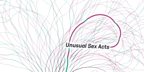
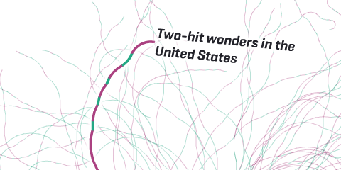
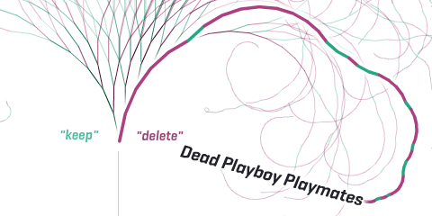
Notabilia visualizes the longest Article for Deletion discussions in the English Wikipedia. It’s a collaboration with Moritz Stefaner (visualization) and Giovanni Luca Ciampaglia (data analysis) and it was launched on the occasion of the 10th Anniversary of Wikipedia. Article for Deletion (AfD) discussions are represented by a thread starting at the bottom center of the screen. Each time a user recommends to keep, merge, or redirect the article a green segment leaning towards the left is added. Each time a user recommends to delete the article a red segment leaning towards the right is added. As the discussion progresses, the length of the segments as well as the angle slowly decay.
Notabilia is the winner of the interactive visualization gold prize at the Information is Beautiful Awards (2012) and was listed by Co.Design among the “22 best infographics of 2011”. It was part of the InForm exhibit (2011) at the Adobe Museum of Digital Media and of the FutureEverything Art Exhibition in Manchester (2012). It has been featured by The Guardian°, Co.Design°, BoingBoing°, Creative Review°, the Norwegian Broadcasting Corporation (NRK)°, Information Esthetics°, FlowingData°, DataVisualization.ch°, NetzPolitik°, Visualizing.org°, BigThink,°, Bright Magazine (38/2011)°, Page Magazine (6/2011)°, Information Architects°, PopTech° and Zooz Magazine.
Just in time for Wikipedia’s forthcoming tenth anniversary, two researchers – Dario Taraborelli and Giovanni Luca Ciampaglia – approached me for a cooperation on visualizing the discussions around article deletions on Wikipedia. The results are online at notabilia.net.
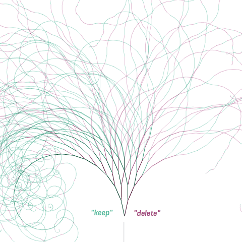
I came up with a tree visualization, where an Article for Deletion discussion is represented by a thread starting at the bottom center. Each time a user recommends to keep, merge, or redirect the article a green segment leaning towards the left is added. Each time a user recommends to delete the article a red segment leaning towards the right is added. As the discussion progresses, the length of the segments as well as the angle slowly decay.
In the visualizations, I tried to capture the tension between chaos and order inherent to the discussions, and provide a nice serendipity interface as well.
So much to learn about…
But also some more hard analysis can be found at notabilia.net, looking at the vote distributions, lengths of discussions, etc. Take a look yourself!
Source: Stefaner, M. 2011. Notabilia – Visualizing Deletion Discussions on Wikipedia. Well-Formed Data. Retrieved January 11, 2011, from: http://well-formed-data.net/archives/570/notabilia-visualizing-deletion-discussions-on-wikipedia.